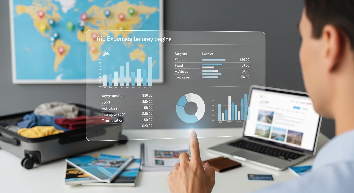
Ever packed your bags only to watch your bank account drain faster than your coffee on a layover? We’ve all been there, staring at a pile of receipts wondering where the money vanished. Visualizing your trip expenses upfront changes everything. Charts and graphs turn scary numbers into clear pictures, helping you spot overspend risks, prioritize fun, and actually stick to your plan. Whether you’re plotting a beach getaway or a city-hop adventure, this approach saves stress and cash. Let’s break it down with real data and simple steps to make your next trip financially smooth.
Why Visualization Beats Spreadsheets
Numbers in rows blur together, but visuals pop right away. Pie charts show spending slices at a glance, bar graphs track daily limits, and line charts forecast totals. Research shows visuals help you understand budgets six times faster than text alone, making tweaks feel intuitive. For travel, this means seeing if flights will dominate your costs before you even book hotels.
People using charts for budgets spot patterns like rising food costs much quicker, which helps cut back on impulse buys. Apps with maps can even pin expenses by location, revealing expensive city zones to avoid. Pre-trip visuals build confidence and reduce that mid-journey panic when surprises hit.
Gather Your Data First
Start with realistic estimates from reliable sources. For a one-week U.S. vacation, plan around $1,991 per person. Europe for 10 days might run $3,000. Use sites like Numbeo for daily breakdowns: $50 for meals in Paris or $10 for transport in Tokyo.
List main categories: flights, lodging, food, local transport, activities, and misc. Add a buffer for surprises.
Quick data sources to check:
- Kayak or Google Flights for airfare ranges.
- Booking.com for hotel averages.
- TripAdvisor for activity prices.
Input these into Adobe Express, Excel, or Google Sheets for instant charts.
Choose the Right Chart Types
Pie charts work best for category splits, like lodging versus food. Bar charts compare destinations or days easily. Line graphs project your cumulative spend over time.
For travel planning:
- Pie for the overall budget view.
- Stacked bar for daily spending by category.
- Heatmap to highlight high-cost days.
Adobe Express and similar tools suggest the best fit automatically, with charts that update as you change numbers.
Core Categories to Visualize
Flights and transport often lead the pack, around $290 for domestic U.S. round-trips or $885 to Europe. Graph these against options like trains to see savings.
Lodging runs $259 per night for hotels, down to $37 for hostels. Use bars to compare choices.
Food averages $100 daily in the U.S., less with street eats abroad.
Activities take a smaller slice; prioritize with bubble charts by cost and enjoyment.
Misc and shopping stay minimal; cap them with a simple donut chart.
Visuals like these reveal imbalances fast, before money leaves your account.
Plug your numbers into a pie chart maker like the one in Adobe Express to see your budget slices clearly and tweak flights if they take up too much space.
Tools and Apps for Easy Visuals
Adobe Express shines for quick, beautiful charts from your data. Start with their budget tracker templates, input numbers, and watch pies or bars form instantly. Export as images or PDFs to share.
It handles travel specifics well: color-code categories, add icons for flights or hotels, and create shareable visuals for group trips. Free tier covers basics, premium unlocks more templates.
Pro tip: Connect your data for real-time updates once you’re on the road.
Step-by-Step: Build Your Visual Budget
Set your total budget first, say $2,500 for a week. Estimate each category based on research. In Adobe Express, start a budget template, highlight the data, and insert a pie chart. Customize colors so big slices like flights stand out in red.
Create scenarios with sliders for best and worst cases. For a Europe trip example:
- Flights at $885.
- Hotel around $800 for several nights.
- Food at $600.
- Activities $400.
- Other $315.
Share the link with travel buddies for group input.
Savings ideas from visuals:
- If food looks high, plan some grocery meals.
- Swap pricey activities for free local spots.
Real Traveler Wins
Solo travelers to dozens of countries use visuals to save thousands, picking local transport like $0.20 metros over taxis. Users of visualization tools often come home under budget by catching patterns early.
Around-the-world trips tracked with charts averaged low daily costs in Asia. Route planners optimized paths and cut expenses noticeably. People who visualize stick to plans better, according to finance studies.
During-Trip Tracking
Your pre-trip visuals set the baseline. Apps update charts live with daily entries. Bar graphs flag overruns instantly. Map views show spending by neighborhood, helping you skip tourist price traps.
Set alerts for category limits. Export reports to review progress anytime.
Post-Trip Review and Next Time
Compare your actual pie chart to the planned one. A line graph of variances teaches lessons, like food always running higher than expected.
Build annual trend graphs across trips to spot habits.
Actionable steps:
- Celebrate any underspend.
- Note top wins for future trips.
- Save refined templates.
Make It a Habit
Visualization takes the mystery out of travel money. Start with one simple chart per category. Tools like Adobe Express keep getting smarter with easy templates.
Your starter plan:
- Tonight: Sketch a pie for your dream trip.
- Weekend: Build it in Adobe Express.
- Before booking: Review with confidence.
Visualize before you go, travel smarter, and spend happier. Safe journeys ahead!

